
Leo B
-
Posts
463 -
Joined
-
Last visited
Leo B's Achievements
")


-
1963-1964 Virtual Car Show
Leo B replied to ronmanfredi's topic in VIRTUAL CAR SHOW for 1963-1964 AVANTI
Gray 4-speed. R2 1963 #R4543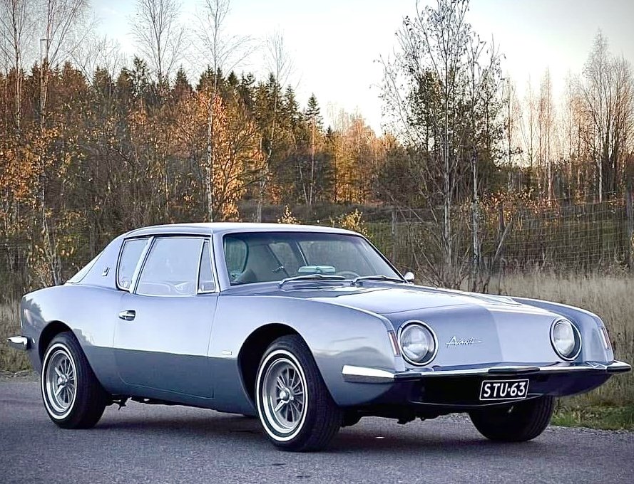
-
I understood that if the car has been sitting for a long time and then all the oil is at the bottom. That is, the engine no longer drains oil to the bottom. Then the cause can only be a crack in the pan or a drain plug. That was the case with me. My plug broke even though I had a copper gasket in it. It was too hard and I changed to a softer synthetic gasket and sealed the threads with Loctite pipe sealant.
-
I have been told that one way to see the source of a leak is to wash the potential leak area well and when it is dry, spread some powder (talcum powder) over the area. This will reveal the location of the leak. I have not tried this yet, but I plan to do so. I just noticed the same in my garage and it was the the drain plug.
-
Hope this helps
-
OK. So when I adjust the caster angle to positive, the bolt is against the left edge of the groove, thus creating maximum adjustment. It's strange that the fit isn't more precise when the groove is suitable for almost a 9/16 inch bolt, but it's good that the parts are correct. Thanks mfg and Zedman.
-
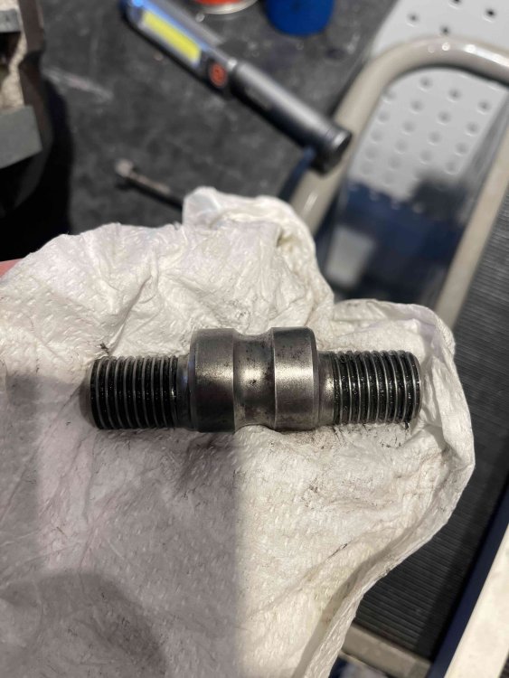
Do I have the correct Upper Control Arm Pivot Pin #524227 or is it meant to be like this? I have correct size bolt 3/8 and the hole for that is not exceptionally loose. The Pin locks easy when the bolt is tightened. But... The pin groove allows for a lot of lateral movement and the groove is wider and deeper than intended for a 3/8 bolt. I can fit about a 0.6 inch bolt in the groove. The 3/8 bolt couldn't have made that groove. This greatly affects, among other things, caster adjustment. IMG_6595.mov IMG_6592.mov
-
Hi, I have replaced all the bushings and king pin bearings etc. In order to adjust the maximum caster, I have installed shims on the lower control arm at the rear and the upper one at the front. I thought that this way I would get the right angle at which I could get maximum rotations with the outer pin. While searching for articles on the subject, I found your old post today. You have apparently done the same steps as me.
How many degrees of caster did you get with your steps?
-

I ended up with 1.75 on the passenger side and 1.50 on the drivers side. The camber was way off on the passenger side and I ended up slotting the top of the frame to get the camber at zero. The car hadn't been wrecked and I had read that this was a common problem with some Avanti IIs.
-
-
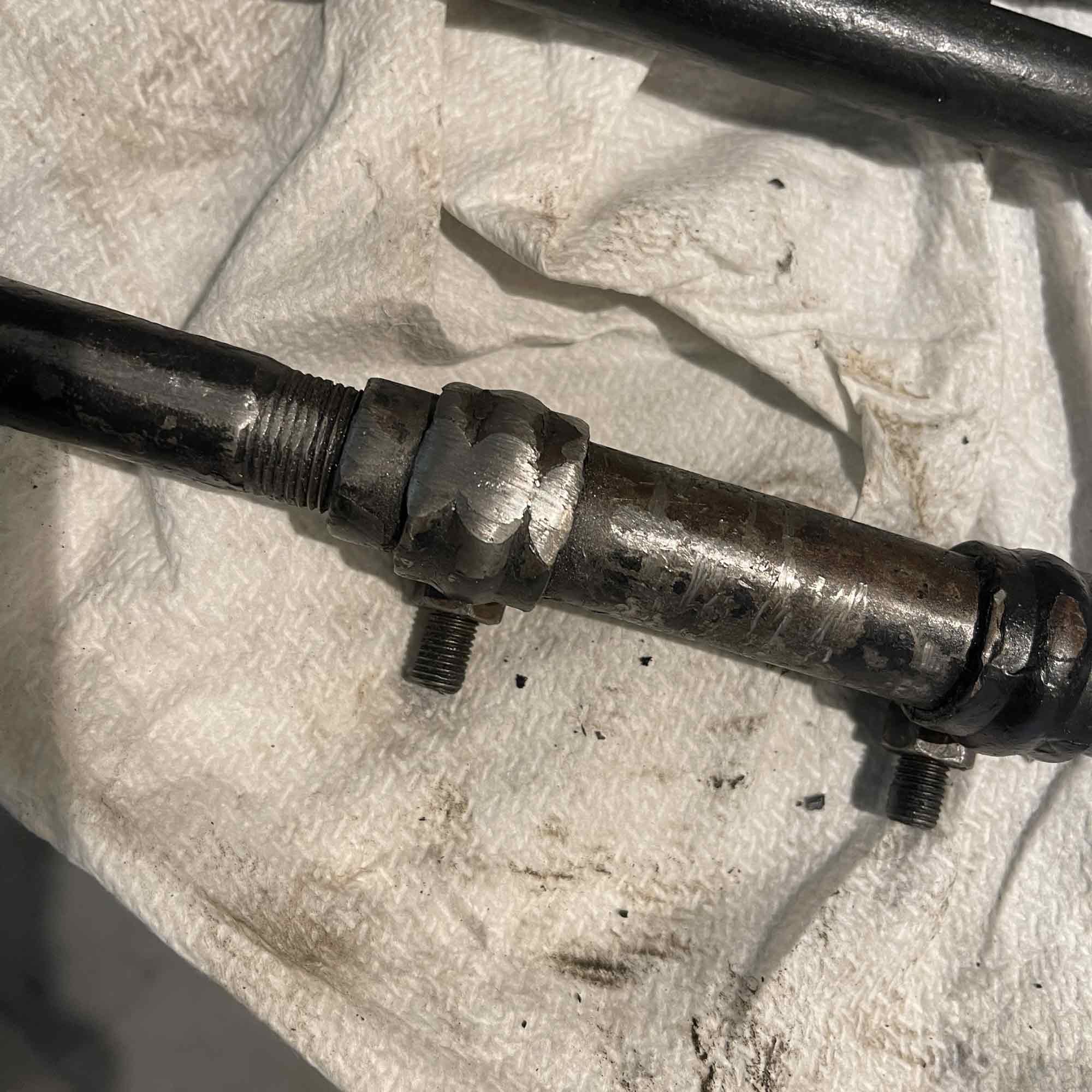
Great! If the exhaust pipe curve is original, it will now be positioned lower than normal. Check that the pipe does not hit the steering tie rod. Especially when the front springs are depressed. I have heat riser in correct right side and keep that open without spring.
-
Should be like this. That looks like a solution of its own.

-
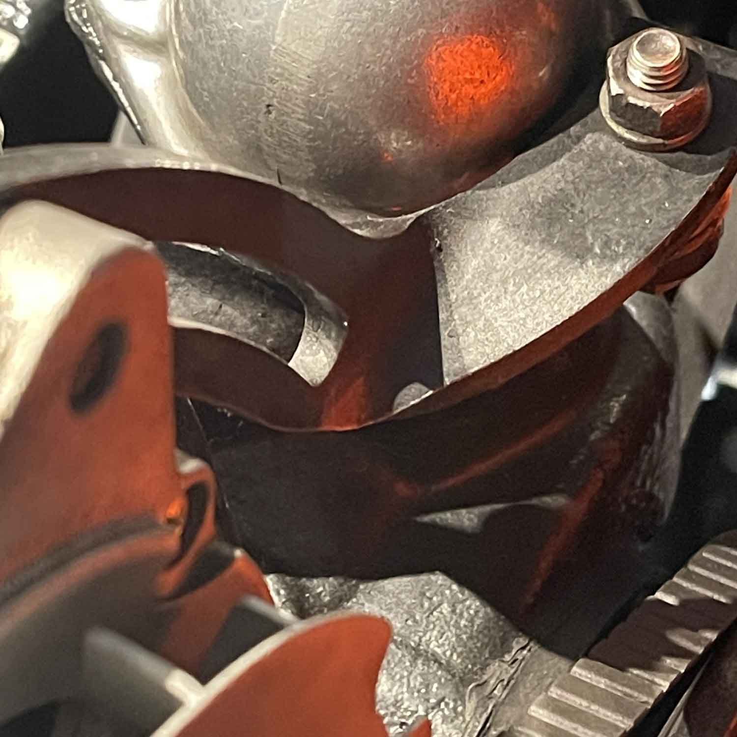
Exhaust pipe from exhaust manifold touches the Tie Rod
Leo B replied to Leo B's topic in 1963-64 Avanti
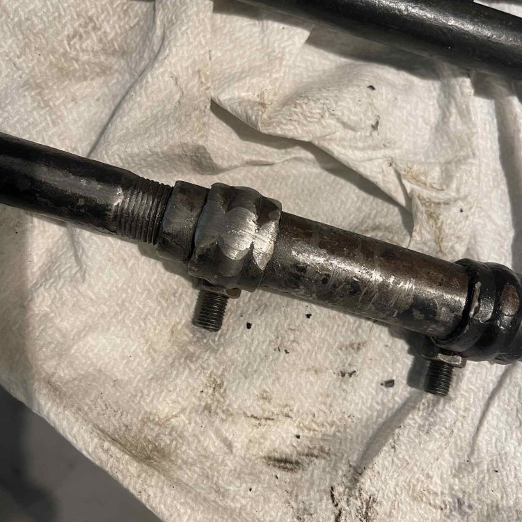
slk1966 Yep. I will do the adjustement. No problem. Dan Booth wrote me kindly that it's possible to the tie rods with the adjuster located on the outside end. Which works fine. It does not change your alignment if you just turn the tie rod around. He confirmed my thoughts. Anyway I need to work with exhaust pipe to give more space.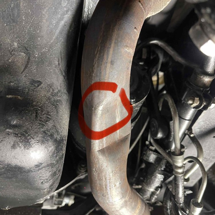
-
I wondered for a long time what the rubbing sound is when turning the car. Now the matter is clear. The left exhaust pipe hits the tie rod clamps when turning the car and when the front sinks lower. I made sure that the exhaust pipe is correctly attached to the exhaust manifold. The engine is also supported with new and correct rubber. I think the exhaust pipe is bent incorrectly. Is there any problem if I turn the short tie rods ends towards the wheels? (long ones towards center)? This would give a little more space between the exhaust pipe and the rod.
-
Original. Lescoa made Ash Trays etc for Chrysler also like this https://www.ebay.com/itm/127534753074
-
The original wheel alignment settings where given with the original tires. I think that wide (like 215/70 R15) tires need different alignment settings. or do I keep same alignments like its written in the original Shop manual? Do you have any experiences?
-
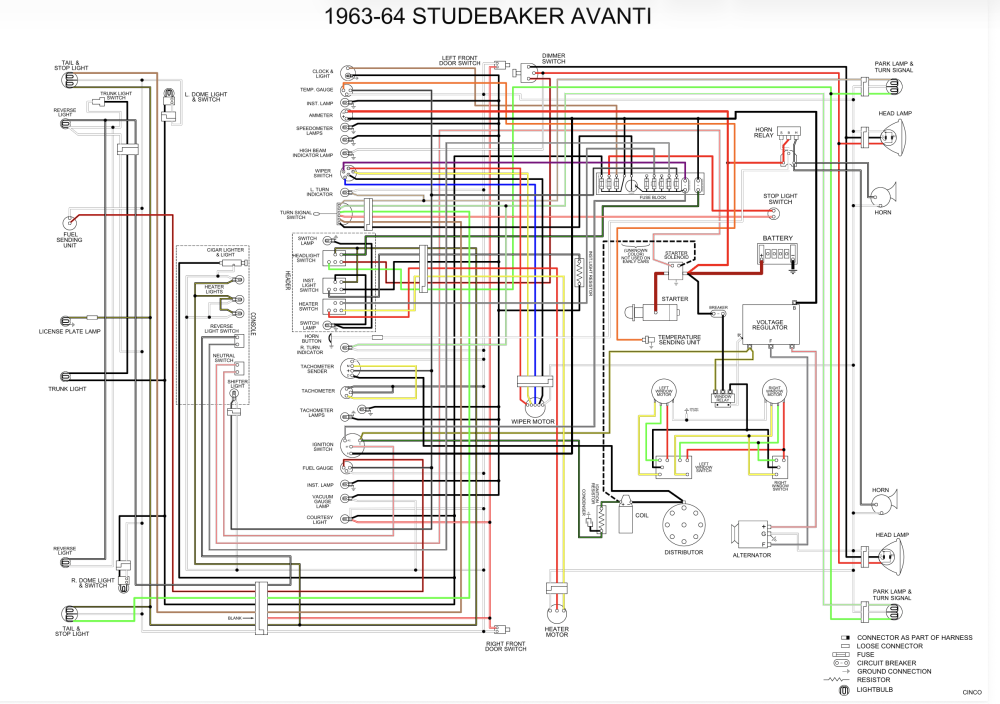
Hope this helps. If you need whole colored wire pdf. I can send you by email.

-
https://aoai.org/forums/topic/11446-outside-rear-view-mirror-placement/ If the bottom of the mirror is "open", the clamping rubbers will not tighten well. Tip: Place 2 suitably high nuts underneath the mirror leg and between the rubbers, against which the rubbers will tighten. (screws through the nuts).